Gallery
 9 licensed
1Password
1passwordNear-black hero with a radial navy-to-black gradient and oversized white display type, cut through by a floating white product-console card that overlaps the dark section and the white body below it. Dense feature-card grids and testimonial blocks alternate dark and white full-bleed sections instead of a single scrolling background.
 6 licensed
1X
1xA pale, warm-grey canvas introduces three home robots in different knit colorways with soft studio lighting fading each figure into the background. Body sections drop into full-bleed lifestyle photography on a deep blue-grey backdrop, where a single mustard-yellow vacuum head is the only saturated colour on the page.
 10 licensed
Abridge
abridgeA healthcare AI marketing site carried almost entirely by full-bleed documentary photography of clinicians and patients, with a wide condensed rounded display face set in white directly over the images rather than in a separate text block. Flat sections in between alternate cream and near-black backgrounds and use a single orange accent for CTAs, eyebrow labels and stat bullets, with a white isometric block sculpture standing in for a product screenshot.
 8 licensed
Affirm
affirmAffirm's homepage runs on a near-black navy canvas with soft blurred blue and violet glow blobs seeping through hairline-bordered, deeply rounded cards, no drop shadows anywhere. Headlines use a light-weight geometric rounded sans with round dots and a single-story a, giving a fintech page an airy, unhurried feel instead of the usual dense trust-blue layout.
 4 licensed
Airbnb
airbnbPhotography-first marketplace UI: rounded 12px listing cards float on a white canvas with no borders, only shadow-on-hover, and every card is a full-bleed photo carrying the design. The pill-shaped, three-segment search bar (Where / When / Who) is the one persistent chrome element, restated identically at every breakpoint.
 7 licensed
Airbyte
airbyteA single near-black canvas from hero to footer, no light/dark toggle at all, held together by a violet glow radiating from a central node-graph diagram. Monospace uppercase labels (nav, eyebrow tags, badges) contrast a big humanist display face for headlines, and every card, code block and connector tile shares the same 1px hairline border with no shadows.
 9 licensed
Airtable
airtableA long-scroll marketing page carried by a confident color-blocking system: each feature gets its own saturated card (rust, sage, sky, navy, forest, magenta) with a large radius, floating a cropped product screenshot inside. White canvas and a plain grotesque typeface everywhere else keep the cards from feeling busy — the color is the only ornament. The hero itself rotates between flat-color slides and one full-bleed ambient video slide.
 7 licensed
Anduril
andurilFull-bleed cinematic photography and video carry every section on a matte black canvas with no cards, borders or shadows anywhere. Monospace equipment-tag overlays (dimensions, connector legends, EST. 2017 stamps) sit against huge condensed sans headlines, reading like hardware documentation rather than a software landing page.
 6 licensed
Anthropic
anthropicA warm off-white canvas carries a bold sans headline with underlines standing in for links, then drops straight into a full-bleed black block set in a serif display face — the only real ornament on the page. No cards, no shadows, no radius on the button chrome; hierarchy comes entirely from the serif/grotesque contrast and generous whitespace.
 7 licensed
Applied Intuition
appliedintuitionA white-canvas marketing site anchored by full-bleed photography of trucks, mining rigs and robots, with a frosted glass capsule nav that floats over the hero image. Below the fold, feature bands alternate photo and copy across a thin vertical rule grid, each headed by a small square bullet and an eyebrow label, then close on a dark charcoal footer with a language switcher.
 8 licensed
Arc
arcA long-scroll marketing page carried by a single electric-blue accent with heavy film-grain noise and wavy scalloped dividers between sections, contrasted against a warm serif display headline. Each product feature is shown as a browser-chrome mockup whose colored 'Space' sidebar (pink, orange) bleeds into a matching gradient border around the whole window.
 9 licensed
Archer
archerFull-bleed golden-hour and studio photography of the eVTOL aircraft carries every section, under thin, widely tracked all-caps headlines and nav labels. A film-strip scrubber of tick marks runs along the very bottom of the hero like a video timeline, and CTAs are drawn as open corner brackets rather than filled buttons, giving the whole page a HUD-like, technical feel over an otherwise dark, spacious layout.
 18 licensed
Aside
asideA bright cyan sky-and-clouds gradient runs behind the whole fold, with a tight geometric sans headline in near-black sitting directly on the image. The product is sold with one large, rounded, softly shadowed app window that overlaps the hero — depth comes from that overlap rather than from borders.
 16 licensed
Astral
astralA pale grey canvas in light mode and a deep aubergine one in dark, both fronted by a chunky pixel-block wordmark and oversized condensed all-caps display type. A neon lime announcement bar and CTA carry the only saturated colour, and a large pixel-glyph illustration sits behind the headline, rendered lime on the light canvas and a low-contrast purple on the dark one. A monospace terminal line with a blinking cursor signals the developer audience.
 9 licensed
Astranis
astranisA near-black canvas carries full-bleed 3D renders of Earth and satellites broken up by bold condensed display type and a single lime-green pill CTA. Sections are separated by long stretches of empty space and hairline dividers instead of cards, and the factory photography is treated with the same deep, low-key grade as the space renders.
 10 licensed
Attio
attioA long-scroll marketing page that carries a CRM's AI pitch entirely through generous whitespace and large black display type, with product screenshots floating in soft-shadowed, rounded cards over a barely-tinted canvas; the page periodically drops into full-bleed black bands with radial line-art to punctuate feature sections.
 10 licensed
Auth0
auth0A dark-purple-to-orange mesh gradient carries the hero and bleeds into a near-black long scroll of feature bands, code snippets and stacked testimonial cards; there is no separate light theme, the gradient canvas is the brand.
 9 licensed
Baseten
basetenA white canvas overlaid with a faint dashed grid gives every section a blueprint feel, carried by oversized black grotesque headlines, monospace labels on every button and badge, and isometric mint-green and pink infra diagrams annotated with live-looking metric chips (replica counts, TPS, requests/min). The long scroll ends in a full black footer with a four-column sitemap and a green systems-status pill.
 7 licensed
Benchling
benchlingA restrained enterprise-SaaS marketing page: deep navy display type, a single rounded product-screenshot mockup with a soft drop shadow doing all the visual work, and a muted grayscale logo wall of pharma customers. Notably sparse below the fold — a long stretch of pure whitespace and a pale blue block separate the hero from the footer, an unusual amount of restraint for a B2B marketing homepage.
 16 licensed
Brex
brexAn enterprise fintech landing page that pairs a bold black type scale with tabletop product photography of the physical card and phone rather than app screenshots or abstract gradients, then repeats that alternating light-gray-panel-plus-copy rhythm for every feature block. The pricing page turns its plan comparison into a collapsible accordion table with grouped feature rows instead of one giant grid, keeping the page scannable despite twelve feature groups.
 9 licensed
Browserbase
browserbaseBold orange highlighter blocks turn a plain black display headline into the hero's focal point over a dithered pixel-art topographic illustration, a treatment repeated for a CRT-monitor graphic and a mountain stat panel further down the page. Thin hairline grid rules run behind every section and monospace tag pills label technical details, giving an otherwise conventional feature-grid marketing page a distinct illustrated identity.
 20 licensed
Bun
bunNear-black canvas with a single hot-pink accent reserved for the word 'fast' and every benchmark bar; oversized heavy grotesque headlines sit above dozens of small monospace terminal panels and check-mark comparison tables that carry the actual proof, with almost no photography beyond a handful of customer video thumbnails.
 9 licensed
Cal.com
calA neutral off-white long-scroll marketing page carried by oversized bold black display type and a live scheduling-widget mockup in the hero; feature sections use plain white cards with hairline borders and no shadows, repeated logo walls, a rotating testimonial carousel and a real tweet wall for social proof, and a dense multi-column footer with compliance badges and store buttons.
 17 licensed
Canva
canvaDesign-tool marketing site built on a saturated purple-to-teal gradient hero scattered with floating 3D icon illustrations (text tiles, a heart, a color wheel) each carrying its own drop shadow, under a rounded script wordmark and an oversized rounded-sans headline. Below the fold the canvas turns white and each feature block becomes its own flat color gradient card rather than a bordered panel, and the pricing page keeps the same purple accent, lifting its recommended tier with an outlined card and a ribbon instead of a shadow.
 10 licensed
Circle
circleA lavender gradient canvas carries a hero of pastel-gradient 3D primitives (arches, steps, a glowing sphere) instead of a product screenshot. The product grid below signals a three-tier hierarchy purely through fill weight (solid blue, blue-outline, pale-blue tint) rather than borders or size, and oversized thin-weight stat numerals in blue read almost like a type specimen against the plain white section.
 10 licensed
Clay
clayA long-scroll marketing page carried by a recurring cast of claymation 3D props (funnel, robot, seesaw) posed differently in every section, against saturated pastel color-blocked backgrounds (coral, chartreuse, pink) that segment the feature list without any cards or borders. Rounded, chunky sans display type and colored pill labels reinforce the toy-like illustration system throughout.
 9 licensed
Clerk
clerkA long-scroll marketing page carried by oversized bold sans headlines on a near-white canvas, with a single indigo accent reserved for links and focus rings. Feature cards use soft shadows instead of borders, and one full-width band inverts to near-black with faint radial glows behind each product-detail card, breaking the light rhythm without resorting to a real dark mode.
 10 licensed
ClickHouse
clickhouseA pure black canvas carries a single high-chroma yellow accent used flatly, never as a gradient, on rectangular panels with hairline black borders and near-zero radius. Diagrams that would usually be abstract illustrations instead show literal data grids and node maps, so the technical claims are argued visually rather than just asserted in prose.
 16 licensed
Cloudflare
cloudflareA conventional long-scroll marketing page carried by one recurring device: full-bleed saturated orange panels (hero and closing CTA) with a fine dot-matrix noise texture and a warm light-glow gradient at the base, dropped into an otherwise plain white/black canvas. Product proof shows up as literal product UI — a dotted globe visualization, a deploy-log dashboard, and an agent-activity console — rather than illustration.
 4 licensed
Cognition
cognitionA warm off-white canvas ruled by thin vertical hairlines into five columns, with small grey numeral labels (01, 02, 03) marking each section like magazine folios. Serif body copy with dashed-underline inline links sits against a sans display headline and a fixed left-column nav, while the footer swaps to a monospace type for its legal links, a small typographic tell that most visitors miss.
 9 licensed
Cohere
cohereA restrained white-canvas long-scroll with an oversized serif-slab display headline carrying the hero, broken up by full-bleed grainy purple product photography and dark in-app screenshots dropped straight onto the page without device chrome. Feature rows alternate copy-left/visual-right, and testimonials sit in a bordered, no-shadow card with a diagonal-cut photo.
 8 licensed
Coinbase
coinbaseA crypto exchange's landing page renders on a plain white canvas by default, carrying its weight through a bold grotesque display headline and a single blue gradient device mockup card with a rounded phone frame inset on top. Feature sections alternate against pale gray tinted panels, pairing black pill CTAs with soft-shadowed rounded phone screenshots, while a dark ticker card and a ring of flat coin-logo circles are the only places color multiplies.
 10 licensed
Column
columnColumn pairs a restrained navy-on-off-white palette with a dotted pixel-art world map that recurs as a background motif throughout the page, and drops live curl command snippets directly into hero and feature cards to speak to a developer audience. A single deep-navy infrastructure section breaks the light canvas midway down the page, using a 3D isometric stack of tokens to visualize its technology layers before returning to the light theme for the product grid and footer.
 8 licensed
Confluent
confluentA black canvas hero carries a glowing blue radial network illustration (a Kafka-topic hub-and-spoke) as the sole visual anchor, no product screenshots needed. The long scroll alternates flat black sections with white ones, using a single blue accent consistently for CTAs, links and the underlying diagram glow.
 8 licensed
Contra
contraA stark white canvas carries an oversized rounded-geometric headline and a chat-style search bar ("How can I help you?") with a pill send button, rather than a conventional hero image. Below the fold the page turns into a dense, color-led masonry of project thumbnails grouped into named rows (Verified studios, AI projects, Brand design, Video editing), so the user-generated imagery supplies all the color against an otherwise monochrome chrome of black text and pill buttons.
 7 licensed
Convex
convexA single yellow-red-purple gradient ribbon bleeds from the dark hero into the cream section below and reappears verbatim lower on the page, turning one illustration into the site's recurring signature rather than a one-off hero flourish. Bold condensed display headlines sit next to monospace, uppercase-labelled terminal boxes, then an olive section breaks the pattern entirely with an italic serif pull quote.
 10 licensed
Craft
craftNotes app landing page carried by paper-cutout illustration and a rounded slab-serif wordmark against a pale sky-blue hero, with each feature section swapped into its own saturated color block (blue, sage green, butter yellow) rather than staying on white. Big serif display headlines pair with italic serif pull quotes for testimonials, giving a long conversion scroll real typographic warmth instead of generic SaaS chrome.
 10 licensed
Crusoe
crusoeA near-black canvas set almost entirely in a monospace face, broken up by one lime-green accent and thin white line-art: a generative parametric curve in the hero, isometric wireframe data-center diagrams further down. Steal the discipline of running an engineering-grade type system through a consumer-facing marketing site without ever softening it into a sans-serif.
 18 licensed
Cursor
cursorA dev-tool marketing page that refuses to look like a dev-tool marketing page: warm off-white canvas, painterly landscape photography behind every product mockup, and a small serif accent on headings inside the app windows. macOS-style window chrome (traffic-light dots, title bars) frames every screenshot instead of raw browser crops, and a single orange accent carries every link and CTA against an otherwise near-monochrome palette. Dark mode is a one-to-one invert, not a separate design.
 3 licensed
Databricks
databricksA plain white canvas makes the oversized near-black headline and Databricks red feel unusually decisive, then hands the visual proof to an oversized, softly shadowed product canvas. Alternating deep-teal bands, warm off-white case studies, and sparse orange details keep a long enterprise page readable without reverting to card-heavy SaaS chrome.
 8 licensed
Datadog
datadoghqA long-scroll marketing homepage that carries a genuinely dense observability product through a conventional white-canvas, purple-accent layout: a tilted 3D dashboard screenshot does the selling in the hero, then alternating black, gradient and illustrated bands break up feature sections without ever feeling cluttered.
Decagon
decagonDecagon's homepage opens on a violet gradient hero with a desaturated lifestyle photo and a translucent blurred chat card, glass laid over color. Below the fold it alternates a white enterprise logo wall and bold indigo stat numerals with black sections holding glass workflow cards, floating chart stacks, and a green-and-navy stat card carousel before a plain black footer.
 9 licensed
Deel
deelDeel's homepage splits the hero into a violet-to-navy gradient panel on the left, holding heavy white slab-sans type and a grid of translucent bordered task buttons with a faint inset highlight, against a real product photo on the right with floating status cards. Below the fold it alternates plain off-white feature tiles with full-bleed black sections that carry the same violet glow and pill-shaped tag chips, so the vivid gradient reappears as a rhythm rather than staying in the hero.
 9 licensed
DeepL
deeplThe hero puts a fully working two-pane translator front and center instead of a screenshot of one, so the product is the hero image. The rest of the page is organised into full-bleed colour bands (sky blue, navy, mint green, lavender) that separate sections more clearly than any card or border could.
 10 licensed
Deno
denoA dev-tool marketing page that earns its long scroll: a dark hero with a floating, ghosted list of API names sets the tone, then code editor chrome, terminal replays, and green-accented benchmark bars against Bun and Node carry every section instead of stock illustration.
 9 licensed
Depot
depotA near-black canvas by default with a faint green radial glow behind the hero, dense hairline-bordered panels, and a single green accent reserved for status and speedup numbers. The whole page is built from real product evidence: a side-by-side GitHub Actions vs Depot CI race, before/after terminal diffs with red/green line highlighting, live benchmark bars comparing real open-source repos, and a four-column wall of embedded customer tweets with avatars and screenshots.
 10 licensed
Descript
descriptA deep wine-maroon canvas paired with a heavy serif display face gives an AI video editor a literary, print-like weight instead of the usual tech-blue gradient. The chat-style AI assistant card overlaps the product screenshot directly, so the AI feature is shown as a conversation rather than a bullet list.
 9 licensed
Discord
discordA deep indigo starfield canvas carries the whole page, with custom 3D mascot illustrations, product screenshots rendered on hardware props, and huge rounded slab-serif display type doing the persuasion instead of cards or borders. Feature sections alternate oversized gradient-filled rounded panels (pink-to-purple, green-to-navy) that bleed mascots across their edges, and the footer closes with the wordmark blown up to fill the full viewport width.
 7 licensed
Docker
dockerA light, blue-accented marketing long-scroll that leans on live-looking terminal windows instead of product screenshots to sell a developer product: macOS-chrome terminal panes with animated CLI progress bars and JSON-log style output sit inside plain white sections, alternating with big-number social proof and flat two-tone icon tiles.
 9 licensed
Dropbox
dropboxWarm off-white canvas long-scroll marketing page carried by oversized rounded product screenshots floating with soft shadows over flat color blocks, alternating with full-bleed lifestyle photography and a near-black high-contrast section for the security pitch.
 9 licensed
Duolingo
duolingoA pure-white canvas carrying an all-caps rounded display face, chunky pill buttons with drop-shadow depth, and isometric mascot illustration in saturated primary colours. The long-scroll landing page alternates two-column feature bands with a single dark navy interruption for the Super upsell, giving the eye a rest before returning to the green-and-white palette that closes on a rounded hill footer.
 20 licensed
E2B
e2bE2B's homepage renders on a stark white canvas edged with hard black 1px borders, oversized condensed headlines carrying a black highlight bar, and small ASCII-style window chrome (three dots, an x, a dashed title bar) framing every diagram. A genuine dark-mode toggle inverts the whole page to black with white type and borders while the orange accent stays constant, and monospace labels, bracket notation and a marquee ticker keep the tone terminal-native throughout.
 10 licensed
Eight Sleep
eightsleepFull-bleed cinematic bedroom photography in deep amber and navy light carries most of the persuasion, paired with a plain grotesque sans for headlines set large and left-aligned. Dark sections interrupt lighter ones to stage glowing blue-and-red temperature-dial graphics and HUD-style stat cards (radial gauges, dotted waveforms), and the page closes on a wall of five-star review cards and two doctor endorsements before a warm brown-gradient CTA band.
 10 licensed
ElevenLabs
elevenlabsOff-white canvas carried by an oversized geometric sans headline and fully-rounded black pill CTAs; the only color comes from a horizontal carousel of glossy gradient spheres and warm-to-cool gradient panels inside feature cards, while the logo wall and safety icons stay flat grayscale line art.
 18 licensed
Expo
expoExpo's marketing page renders on a plain white canvas by default and switches to a near-black canvas that matches the system's colour scheme, both using the same generously rounded squircle cards, pill buttons and soft ambient shadows. Proof of the product comes from real product chrome (a dark code-editor pane, a terminal with a QR code, dashboard and CI/CD mockups) sitting inside neutral grey cards rather than illustration, and the logo itself is a glossy holographic boomerang that catches light differently in every shot.
 8 licensed
Faire
faireA B2B wholesale marketplace that reads as a lifestyle brand: warm off-white canvas, a serif display face carrying every headline, and full-bleed documentary photography of real shop owners instead of product renders. Long-scroll marketing sections are color-blocked in muted olive, butter yellow, dusty maroon and peach rather than separated by cards or borders.
 16 licensed
fal
falA cyan and pink flat-color canvas carries the whole site instead of gradients or photography, with oversized black grotesque headlines punched through hand-drawn pixel-glyph blobs in lime, purple, magenta and yellow. Steal the trick of using one recurring illustration motif, cropped differently in every section, to hold a long developer-marketing scroll together.
 9 licensed
Figma
figmaA near-monochrome long-scroll landing page that lets huge black display type and a single rotating product illustration carry the hero, then proves itself with a 94% Fortune-500-adoption stat and a dense, fully-expanded footer nav instead of an accordion.
 7 licensed
Figure
figureFull-bleed grayscale video and macro photography of the robot carry every section, cut with wide-tracked uppercase headlines and thin-bordered pill CTAs in the corner of each frame. The footer drops the imagery for a numbered plain-text link list and a stark black sign-up pill, the only warm accent left is a hairline red arrow on Contact Us.
 8 licensed
Fivetran
fivetranA long-scroll enterprise marketing page that alternates white and deep-navy bands to separate proof (logos, stats, compliance badges) from product explanation (architecture diagrams, embedded demo). Blue is used sparingly and consistently: primary CTAs, big stat numerals, and the single accent line connecting a product screenshot to a photo, which is the one moment of visual flourish on an otherwise restrained page.
 8 licensed
Fly.io
flyWhimsical hand-drawn creature illustrations (winged servers, sleeping rabbits, a trenchcoated detective) carry an otherwise technical infrastructure pitch, set against soft pastel mesh gradients and large serif display headlines over plainer sans body copy.
 10 licensed
Framer
framerAn almost-black canvas throughout, no light mode, with feature cards outlined in a thin glowing violet or blue border that reads like an active state rather than decoration. Feature sections repeat a strict rhythm — small eyebrow label, two-line headline, one paragraph, arrow link — so the page's persuasion comes from repetition and product screenshots, not copy tricks.
 14 licensed
Gamma
gammaSky-blue gradients and puffy cloud illustrations carry the whole marketing site, punctuated by surreal AI-generated art (a hand spraying whipped cream as a metaphor for editing, a girl staring into a starfield of floating slide cards) instead of product screenshots. Steal the wavy scalloped wordmark divider used as a section break between white and gradient bands.
 9 licensed
dbt Labs
getdbtBright white canvas broken up by full-bleed noisy purple-to-orange gradient panels that frame dark IDE screenshots (VS Code-style editor with lineage graphs and autocomplete popovers); a warm-toned data-lineage diagram and a chunky '10x faster' stat card carry proof without charts.
 10 licensed
GitHub
githubAn all-dark canvas carried by a single purple mesh-glow that recurs behind every product screenshot, with no light theme at all. Feature sections alternate between plain type blocks and glowing device frames showing live product UI (Copilot chat, Actions runs, security fixes), stitched together with a floating cloud/octocat mascot and a closing logo wall of enterprise customers.
 9 licensed
GitLab
gitlabA long-scroll marketing homepage carried by oversized black grotesque headlines set directly over soft warm mesh gradients (pink-to-orange, purple, orange-to-black); dark navy cards and product-UI panels punctuate the white sections, and the whole page alternates between airy white bands and near-black bands rather than staying flat.
 10 licensed
Glean
gleanA long-scroll enterprise AI marketing page carried by glossy chrome-and-gradient 3D blobs (pink-to-blue, green-to-orange) that recur as section dividers against an otherwise plain white canvas, with one full-bleed black section for editorial content. A typewriter-animated search bar in the hero doubles as the product demo.
 9 licensed
Grammarly
grammarlyA confident SaaS marketing page built almost entirely from stock components: bold centered sans headlines, a horizontally-scrolling feature carousel, alternating text/screenshot rows, and a three-tier pricing table with the popular plan lifted by a solid teal banner. What is worth stealing is the discipline of it: one green accent, one dark teal block for the trust/ROI section, and small green-bordered UI-mockup callouts (tone suggestion, reader reactions) doing the job of showing the product without a real screen recording.
 10 licensed
Granola
granolaA warm off-white canvas carries a large serif display headline over an olive-green pill CTA, with app-window mockups tilted slightly and layered on collaged illustration cards rather than plain screenshots. The page alternates full-bleed color bands (an olive block, a near-black testimonial band, sandy mountain photography behind note cards) between long stretches of white, keeping the serif voice consistent from the hero through every section header.
 4 licensed
Groq
groqA monospaced, terminal-flavored headline typeface runs down an off-white canvas as a single scrolling column of short declarative lines, each one fading in from a dim gray to full black as it nears the center of the viewport — the copy itself becomes the scroll-driven animation, with no imagery, cards, or borders anywhere on the page.
 9 licensed
Gusto
gustoGusto's homepage pairs a warm high-contrast serif display face with a plain white canvas and a single dark teal accent held to buttons and links. The hero product shot is staged as a payroll screen surrounded by smaller floating benefit and time-tracking cards with soft shadows, and a row of category tiles each get their own accent-colored 1px border and icon instead of one house colour.
 8 licensed
Gymshark
gymsharkA white-canvas ecommerce homepage built on full-bleed autoplaying video heroes with bold condensed all-caps headlines and stark black-on-white or white-on-video pill buttons, one solid and one outlined. Below the fold it alternates product carousels (heart-icon wishlisting, New badges) with more video banners and filter pill toggles, closing on a dense SEO copy block and a wide multi-column footer.
 10 licensed
Harvey
harveyA law-firm-grade serif (the same voice as the wordmark) carries every headline over an off-white canvas, with hairline rules standing in for card borders throughout. Product screenshots sit inside gritty black-and-white textured photography rather than plain frames, and the page periodically drops to full-bleed black for stat blocks and video case studies, giving a long marketing scroll real gravitas instead of the usual SaaS gradient-and-card treatment.
 9 licensed
HashiCorp
hashicorpA near-black canvas carries the whole page, broken up by isometric glass cubes and mesh-gradient glows in purple-to-orange duotones that stand in for product screenshots. Two-tone gradient CTA cards (Infrastructure / Security) and a dense integration-logo grid give it enterprise credibility without losing the glow-and-glass visual identity.
 9 licensed
Headspace
headspaceA mental health app marketing site built almost entirely from saturated flat color blocks: a mustard-yellow announcement bar and closing CTA band, royal-blue enterprise panel, and warm off-white product cards, all with heavy pill-shaped buttons and a rounded, friendly sans-serif. A smiling orange blob mascot and small floating sparkle and cloud shapes recur as the only illustration motif, standing in for icons and section dividers throughout.
 10 licensed
Hex
hexA long-scroll marketing page that pairs an italic serif display face with a bold grotesque headline in the same hero, over a faint dotted-grid canvas; product screenshots (dashboards, AI chat panels, YAML editors) are collaged with overlapping z-depth rather than placed in single frames, and primary CTAs carry Figma-style corner selection handles as a persistent brand motif.
 18 licensed
heyclicky
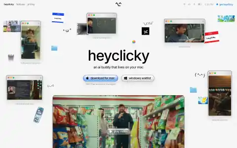
heyclickyThe page is staged as a messy classic-Mac desktop: a real menu bar across the top, a dotted grid canvas, and scattered draggable windows playing .mov clips at angles, interleaved with kaomoji and clip-art. The centre column stays conventionally typeset and lowercase, so the chaos reads as deliberate rather than broken.
 9 licensed
Honeycomb
honeycombA blue-on-white enterprise landing page that sells an abstract product with a concrete mockup: a dark terminal panel scripting a live Claude Code session instead of a generic dashboard screenshot. Each feature band pairs one flat saturated colour field (green, amber, blue) with a floating UI collage, giving a long scroll a repeatable rhythm without resorting to cards or shadows.
 16 licensed
Hugging Face
huggingfaceA long-scroll marketing page that earns its trust-me-I'm-technical feel honestly: the hero pairs a huge friendly headline with a live, scrollable dark model-browser panel instead of a static screenshot, and the playful hugging-face emoji mascot recurs from favicon to a literal pile of emoji filling the footer. Feature sections alternate white cards and a near-black 'Team & Enterprise' block with floating 3D cubes, and dark mode is a full navy repaint rather than a filter.
 10 licensed
incident.io
incidentA large serif display headline carries the hero on a plain white canvas, with the only accent being one browser-chrome product screenshot floating inside a soft orange-to-cream radial gradient panel. Every feature section below repeats that same restrained pairing of a small serif subhead, a short paragraph of body copy, and a single focused product mockup on a warm cream card, instead of stacking multiple screenshots or icons per claim.
 9 licensed
Increase
increaseAn API-first bank's marketing site renders on a stark white grid with a bold grotesque typeface and hairline-bordered cards: card issuing mockups, loan tables and balance charts sit in flat off-white panels with no shadows. Long sections drop to a near-black canvas carrying monospace state-machine diagrams and dotted connector lines between nodes, with a single green, yellow and teal accent reserved for CTAs and data highlights against an otherwise grayscale palette.
 7 licensed
Instacart
instacartA dense grocery marketplace laid out as a conversion-shaped long scroll: dark-green hero banner with a warm food photograph, a horizontally scrollable store carousel with yellow starburst discount badges, then a plain card grid of nearby stores with live delivery times. Deal badges and highlighted "No markups" pills give the eye clear scan points inside an otherwise busy layout.
 10 licensed
Intercom
intercomA serif display headline and asymmetric photo collage carry the hero instead of chrome; below it, alternating feature bands cut between hand-drawn ink illustrations, muted textural photography, and one saturated orange gradient block, so a long conversion-shaped scroll never reads as generic SaaS.
 6 licensed
Joby Aviation
jobyA warm, cinematic photo of a passenger watching a sunset skyline sits inside a hero card with heavily rounded bottom corners, over a bold rounded display typeface. The page then drops into a huge solid saturated-blue field for a pinned scroll section, alternates with a cream off-white band of partner logos, and closes with a flat vector Dream of Flight illustration of clouds and small aircraft above a striped blue, cream, navy and orange footer.
 10 licensed
Klarna
klarnaKlarna's homepage (captured in Finnish) leans on oversized rounded slab-sans headlines, a single hot-pink accent used sparingly as text highlights and pill buttons, and full-bleed lifestyle photography inside heavily rounded squircle frames rather than cards with borders. A scroll-driven list of huge grey headline words brightens to black one at a time as the matching description enters view, turning a plain feature list into a stepped reveal.
 9 licensed
Kraken
krakenA crypto exchange homepage carried by high-gloss 3D renders — liquid chrome sculpture, stacked glass shards, tilted debit cards — dropped into alternating light and near-black bands. Live trading-terminal and market-table screenshots do the credibility work instead of stock photography or icon grids.
 8 licensed
LangChain
langchainA near-black canvas throughout, no separate dark mode because the site is already dark by default, with a rotating engraving-style illustration of Benjamin Franklin as the hero image and a thin blue announcement bar above a hairline-bordered nav. Product diagrams reuse one dark card component with light-blue node pills and dotted connector lines across every framework and lifecycle section.
 10 licensed
LaunchDarkly
launchdarklyA permanently dark, near-black canvas broken up by hand-drawn gradient blob shapes (orange-to-yellow, pink-to-magenta, purple-to-blue) that anchor each feature section, with small dark bento-style dashboard cards (charts, toggles, model-distribution bars) floating on top. Bold black-weight display type and a single lime-green accent carry the whole page; no photography until late in the scroll.
 9 licensed
Ledger
ledgerA hardware wallet marketing site runs almost entirely on a near-black canvas by default, broken up with full-bleed lifestyle photography of the devices in hand and a neon orange Bitcoin glyph rendered as a glowing 3D object over a dark grid. Product cards for the device lineup use bracket-cornered badges echoing the logo mark, orange pill CTAs, and a dense multi-column sitemap footer, with purple gradient text used sparingly for the site's one emotional headline.
 20 licensed
Linear
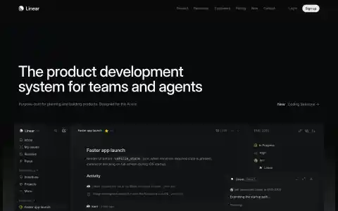
linearNear-black canvas with a tight grotesque set very large and left-aligned, no centred hero and no accent colour in the type. The product is shown as a full app screenshot with hairline borders and a persistent sidebar, floated below the fold so the page reads as marketing on top and product underneath.
 10 licensed
Loom
loomA long-scroll marketing page built almost entirely from large-radius, saturated color panels — pastel use-case cards in green/purple/blue/yellow, a full-bleed blue product panel, a black security band and a dark gradient enterprise close — each section its own rounded, self-contained block rather than continuous white space.
 10 licensed
LottieFiles
lottiefilesA pale off-white canvas carries a giant black display headline paired with a cluster of rounded, custom mascot illustrations in flat saturated colour; the page alternates white sections against a recurring pure-black panel that resets contrast for stats, code and dark product screenshots.
 9 licensed
Lovable
lovableA warm off-white canvas carries an oversized pill-shaped prompt input as the hero's only real UI element, with almost no other chrome above the fold. Dark bands lower on the page switch register entirely: neon-outlined glass cards, a floating browser mockup, a starfield globe and glowing compliance badges sit on near-black with a saturated blue-to-magenta radial glow, and the same gradient mesh bleeds through again behind the footer to bookend the page.
 8 licensed
Lucid Motors
lucidPale tan and white canvas built almost entirely from full-bleed lifestyle photography and large serif display type ("Lucid Gravity", "Lucid Air"), with thin uppercase tracked labels for stat rows and CTAs. Sections are separated by rules and vertical hairlines rather than cards or shadows, and both primary buttons are sharp-cornered with 0px radius, one filled white, one outline. Worth stealing: the repeated hero template of a candid, sunlit lifestyle scene with a serif product name and a three-stat row split by thin vertical dividers, used consistently across every model section.
 9 licensed
Luma AI
lumalabsA rotating collage of warm product photography fills the hero as a darkened backdrop behind a bold white geometric sans headline and a black pill button, with a frosted glass prompt panel overlapping the fold's bottom edge. Below the fold the page drops to plain white with black display type, swings into a pure black band for the Research section, then returns to white for news and team photography, giving the long scroll a two-tone rhythm carried entirely by type and photography with no cards or borders.
 9 licensed
Meilisearch
meilisearchA deep violet-to-magenta mesh gradient with faint diagonal line accents fills the hero, holding a glassy live search demo card with a toggle and result rows. Below the fold the canvas drops to near-black with pink-accented icon tiles, a dark VS Code-style syntax-highlighted snippet, and rounded bordered cards, so the whole page reads as dark by default with the gradient reserved for the top.
 6 licensed
Mercor
mercorA quiet white canvas with one indigo accent reserved for the primary button and the wordmark, a pill-shaped stat bar of live numbers under the nav, and a scrolling row of job cards each carrying a tiny cluster of overlapping avatar circles. Steal the restraint: everything not a stat or a call to action stays in gray on white.
 10 licensed
Mercury
mercuryA deep navy canvas with a restrained indigo accent, generous negative space, and muted radial-glow illustrations standing in for product screenshots throughout the long scroll. The hero deliberately leaves a tall stretch of empty dark space above the fold before the account panel and headline appear, trading immediacy for calm pacing.
 7 licensed
Miro
miroA conversion-shaped long-scroll marketing page built on a plain white canvas: rounded pill nav and CTAs, a soft warm-to-violet gradient blob anchoring the hero, and an AI-prompt input mocked up as a physical object floating over the canvas. Case-study stat cards and a tabbed feature demo carry the page instead of dense copy, and it closes on a full-bleed dark footer with certification badges.
 20 licensed
Mistral
mistralA long-scroll AI marketing page carried by a consistent 8-bit pixel icon system (mascots, plugs, robots) scattered over flat orange/red color-block grids, paired with oversized black grotesque headlines and small monospace all-caps labels like a hardware spec sheet. Dark mode is a full palette swap, not just an inverted background: CTA buttons swap fill/outline roles between themes.
 9 licensed
Modal
modalModal's homepage runs a flat black canvas with a single lime green accent, carrying monospace terminal-style code cards, glossy 3D isometric renders, and a dotted-particle globe plotting GPU regions. Customer case studies break that palette into blurred lime-to-teal mesh gradient tiles inside a dense bento grid, with one pale mint section as the only real departure from black.
 8 licensed
Modern Treasury
moderntreasuryA stark white canvas carries an oversized black display headline set in a tight, slightly condensed grotesque, with generous whitespace and no shadows anywhere. Colour is used only as a signal: mint-green pill labels on the hero diagram, a pale mint panel for the problem statement, and a deep plum panel for product screenshots, each holding a monospace code or terminal snippet as its only ornament.
 8 licensed
MongoDB
mongodbA warm off-white canvas carries a bold, condensed all-caps headline against embedded dark terminal panels showing real query/response JSON, contrasted with deep-navy feature bands. The long-scroll marketing structure (hero, logo wall, feature cards, testimonials, tech-stack grid, footer CTA) stays legible because the terminal panels do the visual heavy lifting instead of illustration.
 10 licensed
Monzo
monzoA long-scroll fintech marketing page carried by bold rounded sans headlines, a single coral brand accent against warm off-white and mint card backgrounds, and a rotating carousel hero of lifestyle photography. Feature bands alternate photo-led cards, phone mockups and squircle tiles with no shadows or borders, just color blocking and generous radius.
 9 licensed
MotherDuck
motherduckA warm cream canvas by default, carried entirely by hard 1-2px black borders with zero corner radius, a chunky monospace display face for every headline, and flat unshaded colour bands (sky blue, mustard yellow, mint, coral) that break up the scroll. A cartoon duck mascot, hand-drawn clouds and a sunburst illustration keep the brutalist structure from feeling cold, and every panel doubles as a boxed product screenshot: a chat/SQL query card, pipeline tables, a Claude Code terminal transcript.
 19 licensed
n8n
n8nn8n's homepage sits on a near-black canvas lit by one dramatic orange-to-red lightning bolt illustration and a warm radial glow bleeding through the hero, while body copy stays cool light grey against gradient blue-to-purple buttons marking every primary action. The pricing page trades that glow for a dense, flat feature-comparison table with green check icons, red-tinted X marks and hairline row dividers, a sharp shift from marketing drama to enterprise-grade legibility.
 10 licensed
Neon
neonAn almost entirely black canvas broken by an animated vertical-bar waveform behind the hero headline, with feature sections alternating between black and a mint off-white band. Monospace labels, hairline-bordered terminal and code-editor mockups, and a copyable `npx neon init` CTA carry a developer-tool register through a long, otherwise typical marketing scroll.
 18 licensed
Netlify
netlifyDark-canvas hero carried by a hand-drawn teal-line illustration and a grinning star mascot, backed by a genuine light/dark theme toggle; the mid-page sections alternate deep forest-green cards with a tabbed code-editor panel showing real syntax-highlighted snippets, giving a developer product a warm, illustrated personality instead of the usual sterile enterprise-blue treatment.
 7 licensed
Neuralink
neuralinkA dark, cinematic macro shot of the implant device carries the hero, with a heavy grotesque headline animated as if being typed live and a plain white pill for the primary action. Below the fold the page drops to a cream canvas where duotone portrait photography in cyan and rose gradients does the persuading instead of icons or borders.
 7 licensed
Notion
notionA dense, information-heavy marketing page carried almost entirely by black slab-serif type at extreme scale, with a single mint-green highlight pill breaking the hero headline. Hand-drawn stamp-style avatar icons and small doodled squiggles add warmth against otherwise flat white, and full-bleed duotone photography (single-hue red/blue/amber tints) turns a plain testimonial grid into something distinctive.
 4 licensed
Nubank
nubankThe default is a light canvas: warm documentary photography of people in motion fills the hero and section breaks, paired with a heavy, slightly condensed grotesque headline set in white over the image or in the brand's violet on white. Copy is Brazilian Portuguese throughout. A pill-shaped segmented control (rounded, filled-violet active state) switches between product lines, and CTAs are solid violet capsules. A scroll-driven section further down the page did not paint in this headless capture; only the mobile layout renders it in full.
 8 licensed
On
onA Swiss running-shoe retailer whose homepage is carried by full-bleed athlete photography and a transparent white-text header, with a bold sans-serif headline over two white pill buttons. Below the hero the palette drops to plain white with pale grey product cards, no borders and only a soft drop shadow, letting the shoe and apparel photography supply all the color.
 16 licensed
OpenAI
openaiA near-monochrome product hub that treats a ChatGPT prompt field as the homepage hero, then uses an editorial mosaic of large imagery and disciplined article cards. Its pricing page turns the same restrained system into a legible plan comparison with black pill actions, fine rules, and generous whitespace.
 16 licensed
Open WebUI
openwebuiAn off-white canvas in light mode and pure black in dark mode, carrying full-bleed oil-painting-style photography in place of any app screenshots or icons. Body copy sits in a plain grotesque with zero-radius rectangular buttons and no shadows or hairlines anywhere, and the long scroll closes on a footer-width lowercase wordmark set larger than the hero headline itself.
 8 licensed
Oura
ouraA warm off-white canvas carries a large serif display face for headlines, dipping into an italic script for single accent words like 'a voice' and 'your everyday'. Macro product photography of the ring against volcanic rock and skin does the persuading, with a long soft cream-to-amber gradient passage giving the copy room to breathe before the page drops into a near-black press band and footer.
 9 licensed
Phantom
phantomA crypto wallet's landing page sits on a pale lavender canvas by default, with a full-bleed black hero panel holding bold abstract painterly ribbons in purple, gold, teal and orange behind rounded pill navigation and CTAs. Below the fold a sticky-scroll story plays through tall rounded cards, purple, blue and cream, stacked with visible edges like a card deck, each holding one short headline and enormous vertical whitespace before the next card locks into place.
 10 licensed
PhotoRoom
photoroomAn e-commerce AI tool that proves its output by filling the whole page with real product photography instead of abstract icons: cutout shirts, colour-swapped caps, and before/after crops sit directly in the layout. A neon-yellow accent appears only on enterprise and trial CTAs, kept rare enough to still read as a call to action against the indigo brand purple.
 4 licensed
Physical Intelligence
physicalintelligenceA cream canvas carrying nothing but a serif wordmark, monospace body copy and a single-column research timeline: each post is a bordered card with a left-hand dot-and-rule spine, and the two or three posts the team wants to surface get a thicker black outline with a hard offset shadow instead of any colour or imagery.
 4 licensed
Pika
pikaA stubby, heavy-weight condensed display face shouts "WELCOME TO THE PIKA UNIVERSE" over a warm off-white canvas, paired with a soft grey rounded prompt box and a single black pill Generate button carrying the only saturated accent. Below the short fold, three sticker-badged feature cards in violet, black and orange sit on a lavender section, and the page closes on an all-black footer with a giant outline wordmark bleeding off the edges.
 7 licensed
Pinecone
pineconeA trust-palette blue-on-white marketing page that borrows dev-tool signals — viewfinder corner brackets on primary CTAs, monospace {curly-brace} tags for stat callouts and integrations, and an embedded product console screenshot — to sell a database to engineers without ever going dark or brutalist about it.
 8 licensed
Pitch
pitchA long-scroll marketing landing built entirely on a purple mesh-gradient canvas: huge white display type sits over a blurred collage of real slide templates, and a floating white AI-prompt bar doubles as the primary CTA. Lower sections switch to a bento grid of toolkit cards, each tinted a different accent (lime, deep violet, lavender) instead of relying on borders or shadows to separate them.
 17 licensed
Plaid
plaidA fintech marketing site built almost entirely from gradient washes: a blue-to-teal hero with a hand-drawn globe wireframe on the homepage gives way to a lighter mint-and-lavender gradient field of colour-coded feature cards, then a dark violet code-terminal band, all stitched together with wavy SVG divider shapes. Pricing swaps the imagery for a whimsical line-art bank-and-piggy-bank illustration and color-codes each of its three tiers (teal, magenta, blue) all the way down through the gradient CTA buttons and the checkmarks in a long feature-comparison matrix.
 18 licensed
PlanetScale
planetscaleA marketing page built entirely in monospace type with hairline-bordered logo grids, ASCII-style dashed-line tables, and inline architecture diagrams drawn with plain boxes and dashed connectors instead of illustrations. Dark mode is a full inversion, not a tint.
 8 licensed
Poke
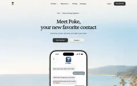
pokeA warm, photographic landing page carried entirely by a high-contrast serif display face over a soft sky-and-sand image. No cards, no borders, almost no chrome — hierarchy comes from type size and generous vertical space, with a single dark pill button as the only strong shape.
 8 licensed
Polestar
polestarThis capture renders in Finnish because Polestar geolocates copy by IP and redirects an explicit /us/ path back to the visitor's own locale; judge the layout and imagery here, not the language. A warm cream-to-white canvas opens on a full-bleed video of a coupe crossing a red desert at sunset, then drops into a strict monochrome grid: hairline rules instead of card borders, thin black-outline rectangles with sharp corners and no fill for every button, one neutral grotesque sans typeface throughout, and a single saturated yellow accent reserved for the merchandise photography near the footer.
 4 licensed
PostHog
posthogA skeuomorphic desktop-OS metaphor for a marketing homepage: a hand-illustrated grass wallpaper sits behind a floating browser window complete with traffic-light controls and a desktop icon dock (Home, Docs, Trash, a fake Demo.mov icon). The actual pitch runs inside that window as a rotating tabbed product demo, with copy delivered in a mix of typewriter underlines and highlighter-pen strokes instead of conventional buttons and cards. Deadpan, joke-cracking microcopy (a legally-required cookie banner starring a cartoon Ursula von der Leyen) carries the brand voice all the way into utility UI.
 14 licensed
Prisma
prismaA dev-tool homepage that trades the usual terminal-dark seriousness for chunky rounded display type, a mint-to-teal gradient hero and scattered particle confetti; three-card feature grid uses tilted, perspective-skewed product screenshots instead of flat mockups, and the whole page (nav, cards, footer) re-skins cleanly to a near-black dark theme via a toggle in the footer.
 10 licensed
Proton
protonPrivacy suite landing page on a white canvas warmed only by soft violet and pink gradient blobs bleeding in from the left and right edges, with an indigo brand accent reserved for buttons and links. Serif display headlines sit above plain sans body copy and a hairline-bordered grid of product icons, and each service section below alternates a lightly tinted screenshot panel with a plain-white text column rather than repeating one template.
 10 licensed
Railway
railwayA dark-canvas cloud-provider landing page carried by a single continuous painterly illustration (starry sky into sunset mountains into a train track) that runs the length of the hero and bleeds into the first feature section, paired with a serif display headline. A dotted vertical rail with colour-coded stop markers threads down the left margin of every feature section, echoing the train motif as a literal scroll progress device. Live usage stats render as a split-flap departure-board display.
 19 licensed
Ramp
rampA restrained white-and-charcoal finance landing page that makes its bright acid-yellow CTA feel consequential, using a fine dotted field, enormous grotesk headlines, and hard-edged product cutouts instead of decorative gradients. The pricing page turns the same system into a highly legible three-plan comparison and an unusually long, disciplined feature matrix.
 10 licensed
Raycast
raycastA near-black canvas cut by diagonal mesh-gradient light beams (red bleeding into teal) that carries the entire hero with no imagery. Feature sections pair plain-language copy with faithful mockups of the actual command palette, clipboard history and AI chat UI instead of illustrations, and the page never leaves dark mode — there is no separate light theme to design for.
 18 licensed
Render
renderA cloud-infrastructure landing page that stays legible under a lot of information density: a strict grid of thin hairlines underlies the hero and section-break bands, gradient text and a purple-to-orange top banner supply the only saturated color, and dashboard/terminal mockups plus small 8-bit pixel-art icons carry the product story instead of stock illustration. Genuine dark mode swaps to a true near-black canvas rather than a simple invert.
 32 licensed
Replicate
replicateA hot magenta-to-yellow gradient with a halftone dot overlay fills the hero band behind stark black-and-white headline type, while everything below drops into a plain grid of monospace code tabs, hairline-bordered hardware pricing tables and small black rectangular buttons with almost no radius. Model cards throughout reuse flat AI-generated thumbnails cropped to one aspect ratio, and a persistent theme toggle sits next to a live green status dot in the footer.
 8 licensed
Replit
replitA cream canvas carries a huge rounded-grotesk headline and a single orange accent repeated through the pill-shaped prompt input, format chips, CTAs and pricing highlight. Testimonials sit inside blob-shaped speech-bubble cards instead of plain quote boxes, and the template gallery is a masonry grid of illustrated client artwork rather than app screenshots.
 20 licensed
Resend
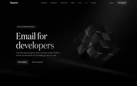
resendDark-only, and close to black-on-black: a thin high-contrast didone serif set very large against a matte 3D cube render lit from a single source. Almost all of the frame is empty dark space, with a gradient-bordered announcement pill as the only colour on the page.
 10 licensed
Retool
retoolAn always-dark canvas built around a single glowing AI prompt box: a cream-colored chat input floats over a blurred, animated screenshot collage lit by a warm orange-to-blue glow. Oversized wordmark treatment repeats as a graphic element in the footer, and the whole page reads as one long pitch for the prompt box rather than a features grid.
 19 licensed
RevenueCat
revenuecatA cool lavender-grey canvas carries a single indigo accent across every CTA, stat number and active icon, set against a coral red used only for the wordmark and a few tags. Bold rounded display type sets each headline, and rather than plain screenshots the product is shown as layered UI panels (a paywall editor stacked over an analytics chart) with soft drop shadows, all inside consistently pill-shaped buttons, inputs and feature cards.
 18 licensed
Revolut
revolutA fintech marketing site that leans on full-bleed lifestyle photography and product shots of physical cards rather than app chrome or abstract gradients, alternating white sections against near-black bands with plain white sans headlines. The pricing page turns a five-tier comparison into one dense scannable table with icon-led row labels instead of five separate cards.
 10 licensed
Rho
rhoRho opens on a black canvas scattered with a faint white starfield behind an oversized bold headline, then alternates full-width black sections against white ones down a long scroll, each dark break carrying a grainy black-and-white halftone photograph (a flower, an insect) rendered as dot-matrix art. A single mint-green accent runs through every CTA and chart against the otherwise black, white and grey palette, and the footer closes on a huge dotted-halftone 'LOCK IN' wordmark.
 10 licensed
Rippling
ripplingA single magenta-to-black duotone repeats across every conversion band on the page (hero, mid-scroll pitch, closing CTA), each lit with a soft radial glow behind blurred metallic 3D discs, while the cream sections between them hold product screenshots in flat tan cards with softly rounded corners and no borders or drop shadows, letting a bold black grotesque headline carry the hierarchy instead of chrome.
 7 licensed
Rive
riveA near-black canvas by default, carried by a condensed all-caps stencil-cut display face with flat chamfered terminals on the wordmark and headline, one amber-bordered CTA breaking an otherwise monochrome palette. Below the fold, a horizontal use-case carousel and repeating hairline-bordered testimonial cards keep the whole page on a strict grid with no shadows or gradients.
 9 licensed
Rivian
rivianFull-bleed outdoor lifestyle photography (interiors, snowy mountains, a Brooklyn storefront) sits on an off-white canvas with pill-shaped buttons in solid black, solid white or outline, never a sharp corner anywhere. Huge condensed black wordmarks like "R1S" stand alone on empty canvas between photo sections, giving the long scroll a magazine-like breathing room.
 8 licensed
Robinhood
robinhoodA near-black canvas carries full-bleed cinematic photography and a slow zoom, with a thin serif display headline set in white over the image rather than a text block. Capsule-shaped lime-green CTAs are the only saturated colour against black, grey and white, and the page closes on an oversized black wordmark set against a solid lime panel.
 7 licensed
Runway
runwaymlA white-canvas marketing page carried almost entirely by full-bleed cinematic video and product photography, with a plain bold grotesque headline set directly over the footage instead of a text panel. A three-way underline tab switcher (Creative / Dev / Robotics) swaps the whole panel's video, copy and links, and the page closes into a solid black footer with a dense four-column sitemap.
 10 licensed
Saronic
saronicA cinematic full-bleed video of an autonomous vessel underway carries the hero, with a huge transparent white wordmark laid over the ship and monospace uppercase labels tracked wide beside it. The rest of the page is built from hard-edged, zero-radius slate and off-white blocks with a single loud chartreuse green used for every button, tag and callout, closing on a dark footer with an X=0 Y=0 coordinate readout as a maritime easter egg.
 9 licensed
Scale
scaleA long-scroll AI-company landing page that leans on a rotating full-bleed hero backdrop (live benchmark chart, MRI scan, macro photography) behind a static oversized headline, then breaks into a scattered, unaligned photo collage for its research section instead of a grid. Case studies and blog posts use a consistent card system, closing on a tan CTA band with a scattered dotted-arrow motif and a five-column dark footer.
 8 licensed
Shield AI
shieldaiA full-bleed video of a simulated overhead battlefield, tinted deep navy and marked up with orange targeting triangles and a HUD countdown timer, fills the entire hero behind a large centered display headline. Wide-tracked monospace uppercase labels and hairline bracket corners styled like a targeting reticle carry through every button and callout, over alternating near-black and light grey sections, closing on a giant pale ghost wordmark across the footer.
 10 licensed
Shopify
shopifyA long-scroll marketing page that swings between a full-bleed candid-video hero with white overlay type and a run of near-black sections carrying deep purple gradients, glows and a scattered starfield of dots. Product proof shows up as realistic mockups (a terminal install flow, a checkout sheet, a dense app-icon grid) dropped directly onto the dark canvas instead of framed screenshots.
 9 licensed
Sierra
sierraA warm, full-bleed autoplay video of a person using a voice agent carries the entire hero, with floating frosted-glass chat bubbles overlaid directly on the footage instead of a separate product screenshot. Below the fold the page settles into a calm, generous marketing-landing rhythm: a muted duotone feature grid, tabular trust badges, and pill buttons throughout.
 8 licensed
Skild AI
skildA pale off-white canvas carries a centered headline mixing bold black and light grey type weights, sitting above a single large squircle-radius video card that is the whole hero, no navigation chrome beyond a logo and a grey pill menu. The page alternates that soft consumer framing with near-black interludes of raw robot photography and a dark green funding-partners wall of rounded logo badges, closing on a matching dark footer.
 7 licensed
SKIMS
skimsA pale grey canvas that steps aside for full-bleed campaign photography, with a bubble-lettered wordmark logo and bold condensed all-caps headlines doing all the framing. No cards, borders or shadows anywhere; the grid is just alternating photo blocks and generous whitespace, with a region-picker modal covering the hero on first load.
 10 licensed
Slack
slackA long-scroll marketing page that alternates white sections against deep-purple bands with soft mesh-gradient glows and sparkle particles; every feature claim is paired with a live, looping product-UI mockup (animated Slack app chrome) instead of a static screenshot, and bold rounded display type carries the hierarchy with almost no cards or shadows.
 9 licensed
Snowflake
snowflakeA conversion-shaped enterprise long-scroll: oversized bold display type carries bare headlines like "STREAMLINE YOUR ARCHITECTURE" in black and Snowflake blue, alternating with dark macOS-chrome product mockups, a dense six-card feature grid, a customer logo wall, and a full-bleed sports photo case study, all closing on a saturated blue CTA band.
 9 licensed
Snyk
snykA near-black canvas cut by a single magenta-to-purple halftone dot-mesh gradient that recurs as the visual signature across hero and CTA band. Bold condensed sans headlines and dark glassy product-screenshot cards carry the story with almost no colour elsewhere except tight semantic reds/ambers inside the UI mockups.
 10 licensed
Sourcegraph
sourcegraphA near-black hero with a faint 3D wireframe grid and monospace micro-labels reads like a terminal before the page suddenly flips to a stark white section with bold grotesque headlines and an orbiting-dot diagram. Product proof throughout is real application chrome: browser-style windows, filterable code search results and dashboard charts, never a stylised illustration standing in for the UI.
 8 licensed
SpaceX
spacexAlternating full-bleed launch photography and orbital imagery carry the whole page on a pure black canvas, each frame paired with a heavy condensed sans caps headline and one outlined ghost button, no cards or dividers anywhere. A live monospace launch countdown sits in the nav bar, the one piece of instrumentation on an otherwise photography-only page.
 10 licensed
Spline
splineA pitch-black canvas holds a live WebGL scene of glossy 3D squircles, hexagons and a cartoon rabbit that the visitor can drag to orbit, with a single solid-blue pill CTA breaking the near-monochrome palette. Feature sections repeat the trick at a smaller scale: a real orbitable cube demo, a soft-shadowed pastel product shot, and code panels for React, Swift and Kotlin sit inside otherwise plain dark cards.
 17 licensed
Squarespace
squarespaceWebsite builder marketing site built on stark black-and-white contrast: a full-bleed cinematic photograph carries the homepage hero under a transparent nav and plain sans headline, then the page drops into a pure black section for stats and a template wall before returning to white feature cards. The pricing page keeps the same monochrome restraint, four flat white tiers on a white canvas with a single blue accent reserved for the recommended badge and links, so the product screenshots inside each card do the selling instead of chrome or color.
 7 licensed
SSENSE
ssenseA fashion retailer that reads as a magazine first and a store second: a serif wordmark logotype for the hero call-to-action, all-caps neutral grotesque for category links, and dense editorial tiles mixing product photography with music and culture writing in a strict grid with no cards, shadows or borders. Typography alone carries the hierarchy across huge serif headlines for feature stories and small caps bylines.
 8 licensed
Statsig
statsigA B2B analytics product that renders its own dashboard as tilted, softly shadowed hero art instead of illustration, and repeats that device-mockup device across every feature card. The gray canvas, pill buttons and monospace tag chips read calmer than typical dense enterprise dashboards.
 7 licensed
Stoke Space
stokespaceA near-black canvas throughout, carried by full-bleed video and photography of hotfire tests and engine hardware rather than illustration, with a heavy condensed display headline over each shot. Buttons are sharp rectangles with zero corner radius and widely tracked all-caps labels, and the only real color break is a mid-page news section that drops to a light gray background before the footer returns to a dark launch photo.
 20 licensed
Stripe
stripeA live-updating hero stat (global GDP running on Stripe) sits above a headline split across two colors, laid over a full-bleed diagonal mesh-gradient ribbon that fades to white; the rest of the page is a disciplined white-canvas grid of bordered feature cards, with color reserved for that one hero band and a single dark navy stats section. The pricing page proves the same system works as a dense line-item table without turning into a spreadsheet.
 18 licensed
Supabase
supabaseA developer-tool marketing page that stays disciplined: near-white (and true dark) canvas, a single green accent reserved for CTAs and highlighted words, and a 3x2 feature grid of hairline-bordered cards with no shadows. Real code snippets and a live-looking dashboard mock carry more weight than illustration, and the long scroll alternates cleanly between feature bands, a gradient case-study card, a scraped-tweet social proof wall, and a dense multi-column footer.
 8 licensed
Superhuman
superhumanA long-scroll marketing page that alternates feature bands between an off-white canvas and full-bleed mesh-gradient product shots, with dark teal/navy editorial interludes, a purple pull-quote testimonial band, and a maroon footer carrying a giant low-contrast wordmark watermark. The homepage serves rotating hero and section copy per load (different captures below show different variants), but the visual system — gradients, floating UI cards, alternating light/dark bands — stays consistent.
 10 licensed
Synthesia
synthesiaA pale lavender-to-blue gradient canvas carries a long marketing scroll where every product shot sits inside a large rounded card with a soft floating shadow instead of a hard border. Headlines mix near-black type with a single indigo-highlighted phrase, and each feature block repeats a small pill-shaped eyebrow label (BRANDKIT, AI SCREEN RECORDER) above its screenshot instead of a section heading, while a floating avatar video bubble with an Unmute control sits fixed over the hero.
 8 licensed
Tailscale
tailscaleA long-scroll B2B marketing page that stays calm despite covering a dense feature set: warm off-white canvas, a single red accent reserved for the primary product tile and CTAs, and product screenshots framed in soft rounded browser/device mockups instead of flat cards. Social proof does a lot of work — a stats-and-case-study row, two full logo walls (customers, then 100+ integrations), and a horizontally scrollable tweet carousel — without ever feeling cluttered because the grid and type stay disciplined throughout.
 10 licensed
Temporal
temporalA dark, monospace-forward developer marketing site that stays legible despite heavy technical content: a starfield mesh-gradient hero, hairline-bordered code/diagram panels rendered in terminal green, and a live workflow-recovery demo embedded directly in the page.
 8 licensed
Together
togetherA friendly rounded-geometric headline face carries the persuasion while monospace uppercase labels (nav CTAs, stat badges, section tags) do all the technical signalling; glossy pastel-gradient 3D shapes and a real dashboard/code screenshot keep an AI-infra pitch from reading as generic SaaS.
 14 licensed
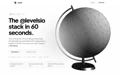
Jotaro
tryjotaroEntirely monochrome with no accent colour anywhere — a heavy geometric grotesque headline against a huge halftone-dithered globe photograph, with uppercase wide-tracked monospace used for every micro-label and eyebrow. Buttons and feature cards are hairline-bordered pills on a near-white canvas, so the dithered image carries all of the visual weight.
 8 licensed
Turso
tursoA near-black navy canvas framed by hairline-bordered rounded containers, with a mint-green primary accent set against a magenta secondary reserved for beta badges and command chips; small glowing illustrated database icons and a dense grid of language logos carry the technical detail instead of screenshots.
 16 licensed
Upstash
upstashA green-to-olive gradient carries every headline against an otherwise near-monochrome canvas, so colour reads as a single consistent brand mark rather than decoration. Feature content sits in flat mint or charcoal cards with no borders or radius over 12px, and the same two-column layout repeats for every product pillar.
 7 licensed
Val Town
valtownVal Town's homepage sits on a warm off-white canvas and pairs a dark brown terminal-window mockup of a Claude Code prompt with a hand-drawn isometric town illustration in muted pastel building facades. Testimonials and a closing street scene keep the same sketchy illustration style threaded between plain text quotes, giving a code-deployment product a storybook warmth instead of the usual dark dev-tool chrome.
 10 licensed
Vanta
vantaA compliance/GRC platform that reads as playful rather than corporate: a recurring bespectacled llama mascot illustrated in different poses carries the page, serif display headlines ('Trust is everything', 'It's all here') sit over a lavender canvas, and the long-scroll marketing structure alternates light and near-black sections with a purple pill-button CTA throughout.
 4 licensed
Varda
vardaA full-bleed duotone satellite terrain photograph in navy and burnt orange fills the entire hero, overlaid with a thin dashed grid and a giant bold orange headline, with no card or button chrome anywhere above the fold. Below it the page breaks into a hard-edged bento grid of flat navy, orange and off-white tiles mixed with photography and video, each carrying only a small eyebrow label and a bold headline.
 16 licensed
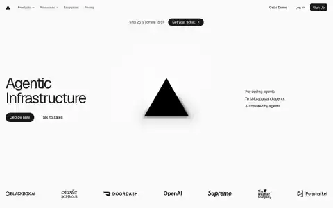
Vercel
vercelStrictly monochrome and grid-disciplined: a large geometric grotesque headline on the left, the triangle mark centred with a soft radial glow, and three terse value lines right-aligned — three columns that share no vertical alignment yet stay balanced. Colour is reserved entirely for customer logos.
 7 licensed
Vuori
vuoriAn athletic-lifestyle retailer that pairs a small serif wordmark and a rainbow-striped square mark with an otherwise plain white nav, then hands the page over to a full-bleed, rotating two-panel photo carousel and square-cornered white outline buttons. Below the fold the palette stays white with tight photo grids for new arrivals, collections, categories and shop-by-color, closing in a black circular logo mark footer.
 15 licensed
Weights & Biases
wandbNear-black canvas throughout with no true light mode; a single warm amber accent runs through the announcement pill, CTA buttons and section labels. Serif display type carries the headlines while monospace code blocks styled as macOS windows sit in the hero, and the pricing page turns into a dense amber-sectioned grid of teal checkmarks and grey x marks.
 8 licensed
Warby Parker
warbyparkerA warm off-white and white canvas carried by a serif display face, including inline underlined blue links set directly inside serif headlines rather than as separate buttons. Pill-shaped navy and blue CTAs, alternating full-bleed lifestyle photography bands, and a UGC grid of customer photos sit between plain product cards with colour-swatch dots.
 8 licensed
Warp
warpA monochrome black-and-white base carries a bold grotesque display headline, then every proof point is rendered as real terminal or JSON output rather than illustration: a purple-tinted CLI pane, raw agent-config JSON, and dashboard screenshots with tabular benchmark numbers. Small monospace labels on buttons and stat blocks keep the developer-tool register even where the layout turns into a plain marketing grid.
 10 licensed
Waymo
waymoFull-bleed cinematic video and photography carry every section, cut with a rounded, friendly display typeface rather than a cold grotesque, and a navy info card is pinned over the hero video itself instead of stacked below it. Product renders on the white sections get a soft cyan glow halo that reads as ambient lighting rather than a badge or shadow.
 20 licensed
Webflow
webflowOversized black grotesque headlines against a mostly white canvas, broken up by light-blue-tinted feature cards and a looping dark logo marquee; the whole page inverts cleanly to a true dark theme rather than just dimming, and product screenshots are inset directly into cards instead of floating as separate hero art.
 18 licensed
Wise
wiseA fintech marketing site that runs entirely on a huge condensed all-caps display face and playful, painterly 3D illustration (a textured globe with gold coins, a keyhole padlock) instead of screen-shot product renders. Bright lime-green and dark-green bands alternate with white and pink-orange textured photo sections, and even the pricing page turns fee disclosure into an itemized, icon-labelled list on plain white rather than a plan-comparison grid.
 10 licensed
Wiz
wizA long-scroll enterprise marketing page that stays legible at scale: a blue-on-white trust palette, consistent line-art cloud/gnome illustrations, and repeated analyst-quadrant and stat-card modules that turn dry proof points (Forrester, G2, Gartner) into scannable visual units instead of walls of logos.
 9 licensed
WorkOS
workosA plain white marketing canvas carries the whole page through type and product illustration alone: a purple-to-blue gradient headline, isometric card mockups of the SSO/directory-sync product, and a single hardcoded dark-navy band for the code snippet. No dark mode elsewhere on the page despite the theme toggle, and no cards or borders outside that one section.
 17 licensed
Writer
writerWhite canvas with a single violet accent used sparingly on links, pill buttons and one rotating word in the headline; the bold condensed WRITER wordmark contrasts with rounded sans body copy and an occasional serif display face on section titles. Real employee photography carries the feature sections, and both pricing pages resolve into long comparison tables of plain checkmarks against a lavender-tinted highlighted plan.
 14 licensed
xAI
xaiA stark black-on-white marketing shell with a true light/dark toggle that inverts every surface, product tile and code-editor mockup rather than just the background. The one recurring pattern is a rounded card holding a macOS-style title bar (traffic-light dots) whether it contains a chat transcript, a terminal trace or a Python snippet, so three very different products read as one family.
 10 licensed
Xata
xataThe entire argument for the product is made in diagrams rather than adjectives: floating branch cards form a loose git-tree layout behind the hero, a split-screen literally contrasts a cluttered shared database against isolated branches, and a cost table runs the arithmetic on compute hours instead of just claiming savings. Everything sits on a near-black canvas with a faint dotted grid and monospace labels throughout.
 19 licensed
Zapier
zapierZapier's homepage sits on a warm cream canvas punctuated by hand-sprayed orange and near-black ink-blot illustrations, with a huge sans display headline and two flat CTA buttons (solid orange, outlined). Deeper sections drop into a near-black card for a hard-hitting counter stat, then return to cream for testimonial blocks that pair a serif pull quote against a duotone customer photo, keeping the orange accent as the only recurring color signal across an otherwise monochrome layout.
 12 licensed
Zed
zedPairs an italic serif display headline with monospace body copy and UI chrome over a dotted blueprint-grid background; the visual language is entirely typographic and line art (a rotating wireframe diamond), with almost no shadows or radius, just hairline borders and a single blue accent.